What is monogram logo? It’s a question that many entrepreneurs and creative professionals ask when seeking to design a sleek, timeless identity. A monogram logo uses stylized initials or letter combinations to represent a brand in a visually distinct way. These designs work across industries—from luxury fashion houses to tech startups, because they simplify a brand’s message into a compact, elegant symbol.
When used effectively, monogram logos communicate authority, heritage, and trust. They help businesses condense long names or multiple concepts into a symbol that fits across packaging, websites, signage, and social media. With about 59% of consumers saying they prefer familiar and memorable logos, monograms offer a straightforward solution.
What Makes a Monogram Logo Unique
A monogram logo compresses initials into a unified design. Think of how “LV” stands for Louis Vuitton or how “GE” stands for General Electric. In both examples, the visual identity uses typography as a signature. These designs rely on type manipulation, spacing, and composition rather than icons or abstract symbols.
The human brain recalls simple logo forms 78% more often than detailed ones. For newer brands, this familiarity gives an edge in crowded markets. You need to understand that the appeal comes from clarity. With fewer elements to interpret, the brain processes the logo faster.
We often recommend monogram logos to clients who want an upscale image, especially in sectors like fashion, finance, law, or real estate. Curate9 focuses on making these logos adaptable so they look flawless on small labels, mobile screens, or large signs.
Typography Choices That Shape Identity
In monogram design, fonts are not just decoration. They are the entire message. Typography needs to reflect the brand’s tone, be it modern, professional, artistic, or traditional. Serif fonts convey sophistication. Sans-serif fonts suggest simplicity and innovation. Script fonts give a personalized, creative feel.
A Chicago-based legal firm used a serif-based monogram of “LB” in dark navy blue. This combination helped their new identity evoke trust and stability. The redesign increased referral traffic by 37% in three months. Louis Vuitton makes a similar choice in their monogram logo:
During our consultation process at Curate9, we test different font styles with real users to see how each typeface aligns with audience expectations. We want every stroke and curve to reinforce the values of the brand.
Balance and Spacing in Layout
Designing a successful monogram requires harmony between letters. Overlapping elements must be intentional, not accidental. If letters touch or intersect, the spacing must feel deliberate and cohesive.
Spacing issues are a common mistake in amateur designs. Uneven alignment or inconsistent negative space can make the logo feel chaotic. The HP logo perfectly defines what is monogram logo. HP uses a grid system to ensure each letter complements the other and feels balanced on all viewing sizes:
At Curate9, we map the letterforms against responsive templates to test how they scale. This helps prevent distortion when used in digital or print formats.
Color Psychology in Monogram Logos
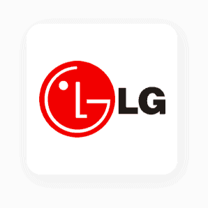
A monogram with the right color combination can emotionally engage the viewer. Blue is used in over 50% of logos across finance and tech due to its calming and trustworthy feel. In LG monogram, red brings energy and action while black stands for luxury and formality.
Curate9 help clients choose brand palettes that resonate with their target demographic. For instance, a monogram for a wellness brand may blend soft green and beige tones to convey natural calm. This process ensures that the logo is not only visually appealing but also strategically aligned.
Where Monogram Logos Work Best
Monograms shine when used across:
- Product Packaging: Compact designs fit neatly on labels or tags.
- Mobile Apps: They remain legible and strong in small-scale icons.
- Business Stationery: They elevate the design of cards, envelopes, and folders.
- Digital Platforms: From Instagram avatars to web favicons, monograms provide continuity.
More than 70% of mobile users say consistent branding improves their perception of credibility. That consistency begins with a versatile logo.
Versatility in a Digital Environment
Logos today must work across multiple formats. A monogram logo makes this easier due to its simplicity. We ensure each design is responsive, capable of adapting from a favicon to billboard signage without losing integrity.
Curate9 provides every client with a logo pack that includes horizontal, vertical, and icon-only variations. This helps businesses maintain a professional look in every user environment, from app stores to LinkedIn profiles.
Monogram vs. Icon-Based Logos
Some businesses ask if they should choose a monogram over a pictorial or icon-based logo. While icons communicate concepts, monograms highlight identity. The decision depends on brand goals. If the name has recognition value, using initials can strengthen it. If the brand is new or abstract, pairing an icon with text might be better. You can see how Chanel uses a monogram logo while Target has adapted with an icon-based logo:

We guide clients through this decision-making process with market research and competitor analysis. For some, we even create hybrid solutions that combine an initial-based logo with subtle symbolic imagery.
Curate9 Helps You Build a Strong Brand Symbol
Understanding What is monogram logo can give your business a visual identity that speaks louder than words. Curate9 designs monogram logos that strike the right balance between simplicity, strategy, and style. Our process includes typography studies, alignment tests, scalability trials, and audience testing.
By choosing Curate9, you get:
- A customized logo system that adapts across all media
- A brand kit with fonts, colors, and style guidelines
- Strategic design backed by market research and brand positioning
Let your logo tell your story with clarity. Reach out to Curate9 to elevate your visual identity through refined monogram solutions.
FAQs
- What is monogram logo, and how does it differ from other logos?
A monogram logo uses letters or initials to create a symbolic brand mark. It differs from pictorial logos by focusing on typography. - Are monogram logos suitable for small businesses?
Yes. They offer a clean, professional look that scales well across materials and builds memorability. - Can I use a monogram for a product-based business?
Absolutely. Monograms fit well on packaging, especially for fashion, beauty, or boutique product brands.