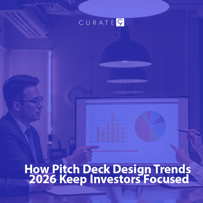
Think about your favorite picture book. Why do you like it? It probably has big pictures and not too many words. Well, the people who give money to new businesses, called “investors”, are just like that!
In 2026, these busy people look at a set of slides for only about two minutes. If you want them to pick your idea, you have to follow the best Pitch Deck Design Trends 2026. If your slides are too messy, they will just stop looking.
Here are some fresh ways to make your slides great so you can win.
1. Design for Phones First
Did you know many investors look at your slides on their phones while they are in a car or drinking coffee? A big part of Pitch Deck Design Trends 2026 is making sure everything looks good on a small screen.
- The Old Way: Tiny words that you have to “pinch and zoom” to read.
- The New Way: Giant text (at least size 24!) that is easy to see on a phone.
If they have to work too hard to read your slides, they might just give up.
2. Dark Mode is In
Have you noticed how your tablet or phone can turn “dark” at night? Many Pitch Deck Designs follow dark backgrounds with bright white or neon words.
This is not just to look cool. It helps the investor’s eyes stay fresh so they don’t get tired of reading. When their eyes feel good, they pay more attention to your big ideas!
3. One Idea per Page
Don’t try to cram everything onto one slide. Pitch Deck Design Trends 2026 teach us that “less is more.”
Instead of five bullet points about your product, just pick the best one. Use the whole page for that one thought. This makes it impossible for the boss to miss your most important news.
4. Moving Pictures and Little Videos
People love things that move. Newer Pitch Deck design trends use small “gifs” or short videos that play by themselves.
If you are building a new app, don’t just show a photo of it. Show a 5-second video of the app actually working! It proves that your idea is real and makes the slides feel alive.
5. Be “Real,” Not Perfect
A few years ago, everyone wanted slides to look like a perfect robot made them. But now, Pitch Deck Design Trends 2026 are all about being real.
Investors like to see:
- Real photos of you and your friends working.
- Hand-drawn notes or circles around important parts.
- A story about a real person your business helped.
6. Clickable Buttons
Imagine if your slides worked like a little website. Pitch Deck designs often include buttons that the investor can click. If they want to see your math, they click a button. If they want to see your team, they click another one. It lets them see what they care about most!
Is Your Slide Deck Ready?
Before you hit “send,” check your work against these Pitch Deck Design Trends 2026:
- Can I read this on a tiny phone screen?
- Is there only one big idea on each page?
- Does it look real and not like a robot made it?
Let the Experts Help You!
Making perfect slides is hard work. Curate9 knows all about Pitch Deck Design Trends 2026. We help people just like you turn big dreams into beautiful slides that bosses love. Don’t let a bad design stop your great idea from coming true!
Contact Curate9 for Pitch Deck Design Trends 2026 to help you win!
FAQs
1. Should my slides be tall or wide?
Most slides are wide, but a new trend in Pitch Deck Design Trends 2026 is making them “tall” like a phone screen. This makes it super easy for investors to scroll through them with one thumb!
2. Is it okay if my slides aren’t “fancy”?
Yes! Clarity is much better than being fancy. If the boss can understand your idea in 3 seconds, that is a “win.” You don’t need lots of glitter, you just need a clear plan.
3. What is the “10/20/30” rule?
Many people on sites like Reddit talk about this rule. It means you should have 10 slides, your talk should be 20 minutes, and your words should be at least size 30. It’s a classic rule that still works great today!