Do you ever feel like your phone apps make work harder? I have looked at many businesses. I see the same thing in small shops and big companies. We build things that look fancy, but they are too slow to use.
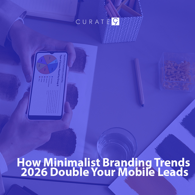
Heavy graphics slow you down. Let’s explore the Minimalist Branding Trends 2026 that focus on ultra-fast loading and simple icons to ensure your mobile users never get frustrated and leave.
Why Being Fast is Best
You do not like to wait on your phone. If a page is slow, you will close it. Curate9 helps by taking away the mess that slows things down.
When you have a lot of big pictures, your phone has to work very hard. It uses a lot of power and data. Many people use their phones while they are walking or riding in a car. Their internet might not be very strong. If your site is “heavy” with big files, it will get stuck. A stuck site means you lose a customer. Curate9 looks at every part of your site to make sure it is light and quick.
We also think about how people hold their phones. Most people use one thumb to click on things. If your site has too many tiny buttons close together, people will click the wrong thing. This makes them mad. In 2026, we make buttons big and easy to find, even if the design looks very simple. This is part of the new trend. We call it “Thumb-First Design.” It means we put the most important things right where your thumb can reach them.
Modern phones are very smart, but they still hate big websites. Think of your website like a backpack. If you put too many heavy rocks in it, you cannot run fast. Minimalist Branding Trends 2026 is like taking out the rocks so you can win the race. We use things like “dark mode” too. Dark mode uses less battery on new phones. If your site saves a person’s battery, they might stay longer! This is a small secret that smart leaders use to keep people happy.
Another part of being fast is how we show information. In the past, sites had long lists. Now, we use “Smart Layers.” This means we only show a little bit of info at first. If the person wants to see more, they tap. This keeps the phone from getting confused by too much data at once. It makes the site feel like it is thinking ahead for the user.
1. Words That Are Easy to Read
We use special letters that look good but are not heavy files.
- The New Way: We use “variable fonts.” This lets us have many styles of text in one tiny file.
- The Win: Your “Book Now” button is easy to find, and the page stays very fast.
Using these new fonts also helps you tell a story. You can make some words big and some words small to show what is important. Because the file is small, your phone does not have to wait to show the words. You get a fancy look without the slow wait.
2. Tiny Pictures
We use small icons instead of big, heavy photos.
- Line Art: These are thin drawings. They look very clean on a small screen.
- Soft Buttons: These look like real buttons you can press. It makes people want to click.
Using these icons makes your site look very neat. Think about a clean room. It feels good to be in a clean room. A clean website feels the same way. When things are tidy, people stay longer. They feel like you are a pro who knows what you are doing.
In 2026, we will also use “Micro-Animations.” These are tiny movements. Maybe a button wiggles a little bit when you look at it. This tells the user, “Hey, click me!” It does not slow down the phone because the file is very small. It makes the site feel like a toy that is fun to play with. When people have fun, they are more likely to buy from you.
3. The Box Look
A Bento box has little spots for different food. We do that for websites too. We put your help—like skin care—into neat boxes. It is easy for a person to find what they need with one tap.
This box look is great because it changes shape. On a big computer, the boxes sit side by side. On a small phone, they stack on top of each other. This is called “responsive design,” and it is a big part of Minimalist Branding Trends 2026. It means your site looks perfect no matter what phone someone is using.
We also use “white space.” This is the empty space around the boxes. It acts like a breath of fresh air. It stops the user from feeling overwhelmed. When there is space to breathe, the user can focus on your message. They see your price or your services and they don’t feel confused. This clarity is what leads to more people signing up for your help.
Think about the last time you were on a messy website. You probably felt a little bit stressed. Now think about a site that is just a few boxes and big, clear words. You feel calm. In 2026, the brand that makes the customer feel calm is the brand that wins. Curate9 builds these calm spaces so your customers feel safe and ready to book.
How This Helps You Grow
When your site is simple, more people will book a visit.
- No Wait: A fast site makes people trust you.
- Easy Choices: When it is not messy, it is easy for a person to say “Yes.”
- Search Help: Google likes fast sites. A fast site will show up first when people look for help.
Make Your Brand Fast Now
Do not let a slow site stop you. Curate9 knows how to use Minimalist Branding Trends 2026 to make you look good and work fast.
Talk to Curate9 and let things work best for you!
Frequently Asked Questions (FAQ)
- Will my site look plain or boring?
No! Simple is smart. We use bright colors and cool words. It looks new and fast, not boring.
- How do the new fonts help me?
They make the site open fast. People do not get mad and leave. This helps you get more customers.
- What is a big mistake on phones?
Using too many big photos. Big photos take a long time to show up. It is better to use small, clean drawings that load in a snap.