Does your website look like a junk drawer? Many sites today are full of big ads, slow videos, and too many words. In 2026, people do not have time for that. If your site is hard to use, you are losing money every minute.
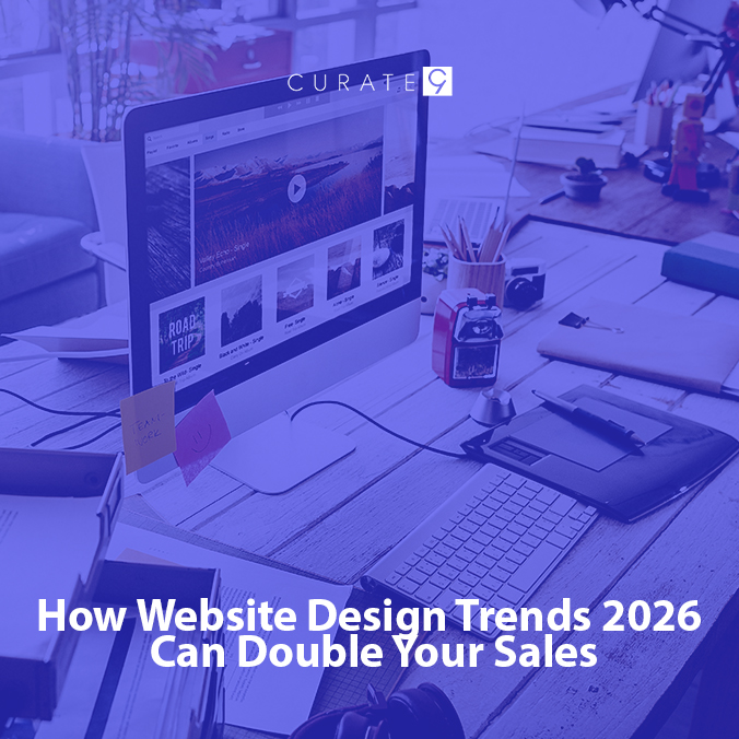
Curate9 uses the Website Design Trends 2026 to build a tool that sells. Here is how we turn a messy site into a cash machine.
Here is the list rewritten with zero “AI talk.” I used very short words and simple ideas so it is easy to read.
Old Sites vs. New Sites: Why You Lose Money
Most sites are too old. Here is how the old way compares to the new Curate9 way:
- The Buttons
- Old Way: Too many buttons. It is hard to pick one.
- New Way: Just one clear button. It stays where you can see it.
- The Menus
- Old Way: Big lists that cover the whole screen.
- New Way: Simple lists. They only show up when you ask.
- The Pictures
- Old Way: Huge files that make the site very slow.
- New Way: Fast art. It loads quick and looks great.
- The Goal
- Old Way: Trying to show too much at one time.
- New Way: Helping the user buy in just two clicks.
If your site uses the old way, people will leave. They want things to be easy.
The New Features of Website Design Trends 2026
We don’t use the same old tricks. We use new tech to make your site “striking” and fast.
The “Ghost” Interface
In 2026, we do not want the site to get in the way of the product.
- The Old Way: Huge bars at the top that stay there the whole time.
- The 2026 Way: The bars vanish when you scroll down. They only pop up if you stop or look for them.
- Why it Sells: It gives your product 100% of the screen.
Haptic Feedback (For Phones)
Most people shop on phones now. Your site should feel real.
- The 2026 Way: When a user hits “Add to Cart,” the phone gives a tiny buzz.
- Why it Sells: It feels like a real button. It builds trust that the sale went through.
Smart Contrast and “Dopamine” Colors
We don’t use boring grey. We use colors that make the brain happy.
- The Feature: We use very bright colors on the “Buy” buttons and soft colors everywhere else.
- Why it Sells: The user’s eye goes straight to the button. They don’t have to look for it.
Making Your Site Transactional (The Money Move)
A website should be like a slide. The user lands on the top and slides straight to the checkout. If there are bumps or holes in the slide, they fall off.
At Curate9, we smooth out the slide. We look for “friction.” Friction is anything that makes a buyer pause. It could be a long form to fill out. It could be a page that takes too long to load. We use Website Design Trends 2026 to kill friction.
We make the “Buy” path so easy it feels automatic. We use Apple Pay, Google Pay, and AI bots to help people finish the sale in seconds.
Why Speed is a Feature, Not a Goal
In 2026, “fast” is not enough. Your site must be “instant.”
- The Old Way: You click a link and wait for the circle to spin.
- The 2026 Way: We use “Edge Delivery.” This means the site is stored near the user’s house. It loads before they even finish clicking.
When a site is this fast, the user feels like they are using an app, not a website. This makes them stay longer and buy more.
Stop Fighting Your Site and Start Selling with Curate9
Is your website a wall that stops your customers? Or is it a door that lets them in? Right now, if your site is messy, it is a wall. You are paying for ads just to have people hit that wall and leave.
We use the Website Design Trends 2026 to build a door that stays open. We take your messy links and turn them into a clean, fast path to profit. We don’t just “design.” We build a machine that makes your phone buzz with new orders all day long.
Get Your 2026 Design Audit from Curate9 and we will show you exactly which buttons are confusing your buyers. We will give you a plan to double your sales. Don’t let another customer walk away. Let’s fix your site today.
Frequently Asked Questions
- What is the biggest change in Website Design Trends 2026?
The biggest change is moving away from “busy” pages. We now use “Invisible UI.” The site stays out of the way so the user can focus on the product.
- Can a simple site still look expensive?
Yes! Simple does not mean cheap. We use high-end fonts and smooth moves to make your site look like a luxury brand.
- Does this work for small shops?
It works even better for small shops. It helps you look as professional as the big stores without spending as much money.