Have you ever walked past a shop and felt like you knew exactly what was inside? Even without reading the sign, you felt a sense of trust. This is the magic of a great logo. It is the face of your business. It tells your story before you even say a word. In the old days, getting a professional look took many weeks and cost thousands of dollars. Today, you can use Canva to turn your best ideas into a real brand in just a few minutes.
It is important to look like a leader from the start. This guide helps you build a brand that is ready to show the world. We will stay away from the common designs that everyone else picks. Instead, we will help you make a look that belongs only to you. You do not have to be a great artist to do this. You just need a clear goal and a simple plan to follow.
Phase 1: Picking Your Brand Voice
Before you start using any tools, grab a pen and a piece of paper. You need to decide exactly what you want to tell your customers. This is the heart of your whole business. Is your shop fun and fast? Is it quiet and calm? If you do not plan this, your logo will look confused. A messy logo makes customers feel nervous. We want them to feel safe the moment they see your sign.
Write down five words that describe your work. If you are starting a fresh juice bar, your words might be: Bright, Healthy, Fast, Cold, and Sweet. These words act like a map for your design. Without them, you might pick colors that do not fit. For example, a dark grey might not work for a happy juice bar.
Colors change how we feel inside. Blue makes people feel calm. Orange makes people feel hungry. Red feels like it is moving fast. Pick two main colors that match your five words. This plan makes sure your design choices fit your goals. This ensures you choose the perfect colors for the people you want to serve, rather than just picking a shade you like. It is about what your customers need to see.
Phase 2: Exploring Great Ideas With Simple Tools
Canva has a tool called Magic Design. It is like having a creative friend inside your computer. To start, do not just type the word “logo” into the search box. That is a common trap. If you only type “logo,” you will get the same basic shapes that everyone else has already seen. To stand out from the crowd, you must use a specific story. We call this a power prompt.
For a flower shop, try typing: “Simple logo for a fresh flower shop using soft pink colors and a single leaf icon.” These details stop the computer from giving you boring ideas. It forces the tool to think about your specific dream. You want a look that belongs only to you. You do not want to look like the shop down the street.
The tool will show you many options. Look for a spark. This is an idea that feels like it could be the face of your company. Try to find the sharpest shape and the neatest design. Many times, the first few ideas are just okay, but the third or fourth one is the winner. Do not rush this part. Wait until you find the look that truly feels right in your heart.
Phase 3: Making a Mark That People Remember
If the first ideas are not perfect, you can use the Text to Image tool. This lets you describe the exact symbol you want. This is where you can be very creative. To get a high-end look, use what we call the Clean Rule. When you ask the computer to draw a shape, add these words: “Flat style, very simple, white background, no shadows.”
Asking for a flat style makes sure the logo looks modern and new. Shadows and 3D effects often make a brand look old or messy. Tiny details are very tough to spot on a mobile phone. Your goal is to make a brand that feels like it belongs in a high-end shop. Simple shapes are much easier for people to remember. They are also much easier to print on boxes or shirts later on.
Think about the shapes too. Circles feel friendly and kind. Squares feel strong and steady. Triangles feel fast and smart. If you sell warm blankets, use soft and round shapes. If you build strong fences, use solid and square shapes. Matching your shapes to your work builds trust. It shows people what kind of shop you run before they even step inside.
Phase 4: The Real World Stress Test
A logo must work in the real world. It needs to look good on a giant sign and a tiny pen. It cannot just look good on a bright screen. Try these three checks to see if your brand is ready to show the world:
- Simple Color Check: Does the logo still work if you take all the color away? A strong design is built on a strong shape. If it only looks good because of a bright color, the shape is too weak. Imagine your logo on a simple white receipt. If it turns into a black smudge, you need to make the shapes simpler.
- The Squint Test: Put the logo on your screen and walk back. Look at the screen and squint until your vision is a bit fuzzy. If the logo turns into a messy blob, it has too many small details. You should be able to see the main shape even when your eyes are half-closed. Try making your lines thicker and your shapes much bolder to fix this.
- The Small Size Check: Shrink your logo down to the size of a postage stamp. If you cannot read the name, the design is too crowded. Most people will see your logo as a tiny icon on a phone screen. It must stay clean and clear at that small size. If the words are too thin, they will just look like a blurry line.
Phase 5: Getting Ready to Grow Big
The work you do in Canva is a great first step. But to truly grow, you need to move from “dots” to “lines.” This is a very important move for your future. Most computer pictures are made of tiny dots called pixels. If you try to stretch a picture made of dots to fit a big store sign, it will look blurry and messy.
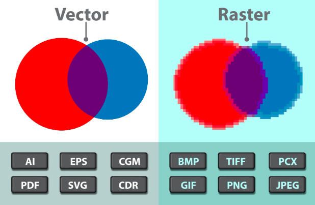
Professional logos use vectors. Vectors are based on math and lines. This means they stay perfectly sharp at any size. You could print a vector logo on a tiny ring or a giant airplane, and it would look exactly the same. While Canva is great for finding your vision, we recommend having a professional draw your final choice again as a vector file.
This ensures you can print on anything. This could be a coffee cup, a t-shirt, or a giant sign on a building. You will not lose quality. It also means you truly own your look. In the year 2026, the law says you must have a human touch on your art to own the rights. Having a designer finalize your AI sketch makes your brand safe and legal. It ensures your dream look is yours forever.
What You Need To Overcome?
To look like a pro from day one, avoid these common traps:
1. Using Too Many Fonts
Stick to one or two fonts. Using more makes the design look like a mess. It confuses the eyes of your customers.
2. The “Everything” Logo
Do not try to put a sun, a mountain, and a tree all in one circle. Pick one strong symbol. A logo should be a mark, not a whole painting.
3. Spelling Errors
The computer is a great artist but a poor speller. It often makes up its own strange letters. Always double-check that your brand name is spelled right.
4. Following Trends Too Closely
Bright neon colors might be popular now, but will they look good in five years? Simple, classic designs never go out of style.
Smart Tricks for Better Art
To get the most out of your tools, you need to use specific rules. Here are the top tricks experts use:
The “No Glow” Rule
Do not use glows or soft shadows. While they look cool on a phone, they are very hard to print. A logo that works in solid black ink is a logo that works everywhere.
The 1:1 Rule
Always make sure your logo fits well in a square shape. Most social media pages use a square or a circle for your profile picture. If your logo is too long or too tall, it will get cut off.
Using Negative Space
Try to find a design where the “empty space” makes a shape too. For example, the space between two trees could look like a house. This makes your logo look very smart and professional.
Keeping Your Art Safe
This is very important for any new brand. Right now, the law says you cannot own a copyright on an image made 100% by a machine. This means a different shop could use your look, and you might not be able to stop them. To protect your brand, have a human designer make changes to the design. This makes it a “human-made” piece of art. This is the only way to truly own your look and keep it safe from others.
How To Make Sure Your Logo Sticks in People’s Minds?
Try these tricks:
- The “One-Thing” Rule: Pick one main shape or icon. If you have a coffee bean, you don’t need a steam cloud and a spoon too. Just the bean is enough.
- Keep it Simple: Look at your work and ask, “What can I cut out?” Usually, the more you take away, the stronger your brand becomes.
- Watch the Gaps: Make sure there is enough empty space in your design. If the shapes are too crowded, they will just look like a dark smudge from far away.
- The Memory Check: After you finish a draft, close your eyes and try to draw it on a piece of paper. If you cannot remember where the lines go, your design is too busy.
Designing for the Real World: How Your Logo Lives on Stuff
It is easy to feel happy when you see your logo on a bright computer screen. It looks sharp, the colors are bright, and everything feels just right.
But we have to remind you: your logo doesn’t live on a screen forever. Eventually, it has to go to work in the real world. It’s going to be printed on a brown cardboard box, embroidered on a staff polo shirt, or stuck as a vinyl decal on a shop window.
If your design has tiny little dots or very thin “hairline” strokes, it’s going to fail the moment it hits a printer. Thread and needles cannot stitch microscopic details, and cheap printers often “bleed” ink, which ruins thin lines. You want a “tangible” brand, one that looks just as good on a rough paper bag as it does on your Instagram profile.
Before you call the logo “finished,” run it through these physical checks:
- The Embroidery Test: Imagine your logo being stitched onto a hat. Are the parts solid enough for a needle to follow?
- The Cardboard Check: How does your color look on a non-white surface? Certain shades can fade away when you place them on brown or gray surfaces.
- The Sticker Check: If you turned your logo into a sticker, would it stay as one solid piece? Or are there many tiny, floating parts that would just peel off and get lost?
- The Stamp Test: Imagine turning your logo into a simple rubber stamp. Could you still tell what the mark is?.
Why “Good Enough” is the Enemy of Your Success
We see it all the time: a new business owner gets a result from a tool like Canva, says “That looks fine,” and launches their brand. But “fine” doesn’t win in a crowded market. Other people in your market are likely using the same basic tools and picking the same popular designs. If you want to lead, you have to move past these common styles. You must keep working on your design until it feels like it was made just for you.
Picking a plain logo tells your customers that your business might be plain, too. It makes them feel like you did not put in much effort. This might make them worry that you will not work hard for them either. A high-quality look proves that you are very serious about what you do. It shows you have taste and that you are building something meant to last for years, not just weeks.
Here is how we move from “okay” to “iconic”:
- Change the Perspective: Don’t just look at your logo straight on. Try turning the icon, changing the thickness of the letters, or picking colors that do not usually go together.
- Avoid a Cheap Look: If your symbol looks like a free sticker you could find anywhere, keep looking. Try to find a shape that feels fresh and new.
- The Gut Check: Look at your logo and wait to see how it makes you feel. If you do not feel proud when you see it, you are not finished yet.
- Professional Polishing: Sometimes all an “okay” logo needs is a professional eye to fix the alignment or the spacing between letters (we call this kerning).
The Quiet Talk of Shapes: What Your Logo Says Without Words
Many people only think about the colors and the name. But the shapes you use are talking to your customers every single day. Shapes have their own feel. A circle feels much different than a triangle. If you are starting a yoga class, a sharp star might look too mean. If you are building houses, a soft cloud might look too weak.
You want your shapes to match the promise of your work. When the shape and the job fit together, it creates a good feeling. Customers cannot always explain it, but they can feel it. It makes them trust you without even knowing why.
Think about what these shapes mean before you pick your final mark:
- Circles and Ovals: these shapes make people think of friends and being together. They feel soft, kind, and very safe.
- Squares and Rectangles: These represent stability, strength, and efficiency. They feel like a solid foundation, perfect for banks or builders.
- Triangles and Sharp Angles: These suggest power, direction, and movement. They feel fast and high-tech, but they can be “pokey” if not used carefully.
- Vertical vs. Horizontal Lines: Up-and-down lines feel strong and bold (like a skyscraper), while side-to-side lines feel calm and peaceful (like the horizon).
The “Social First” Brand: Winning the Battle of the Thumb
Let’s be honest: most of your customers are going to see your logo for the first time while they are bored, scrolling through a social media feed on their phones. In that environment, your logo is tiny. It’s a little circle next to your username. If your logo is a long rectangle with your full name and a small icon, it’s going to be impossible to read. It will just look like a blurry line.
We live in a “mobile-first” world now. This means your brand has to be “responsive.” You need a version of your logo that is built specifically for that tiny social media profile spot. Usually, this means taking your main symbol and making it the star of the show, leaving the text out of the circle entirely.
To win the “Battle of the Thumb,” consider these design moves:
- The 1:1 Aspect Ratio: Make sure your main icon fits perfectly inside a square or a circle without touching the edges.
- High Contrast Colors: On a small screen, colors can wash out. Use bold pairings so the shape “pops” against the background of the app.
- The Favicon Test: Look at your logo at the very top of a web browser tab. If you can still tell it’s your brand at that tiny size, you’ve won.
- Keep it Centered: Social media apps often crop your photo into a circle. If your icon isn’t perfectly centered, it will look lopsided and amateur.
Are Human Skills Required?
Smart tools are fast and helpful, but they do not know your heart. They do not know the people in your town. They only know patterns. To truly win, you need a brand that stands out and connects with people.
Curate9 takes your early ideas and turns them into professional tools. We fix mistakes, make the lines perfect, and create a full set of rules for your brand. This ensures your logo works on every post, every package, and every sign you ever make. We help you move from a “just starting” look to a “market leader” look.
Launching Your Vision with Confidence
Building a professional brand is a journey that starts with a single, clear vision. Using tools like Canva is a brilliant way to spark your imagination and see what is possible. However, the true strength of a brand lies in its ability to grow and stay unique. A logo that is “launch-ready” must be simple, sharp, and legally protected. By following the steps in this guide, you have moved from a basic idea to a solid foundation. You now have the knowledge to avoid common traps and lead your business toward a successful future.
Curate9 is highly passionate about taking those initial sparks and turning them into iconic brand identities. We ensure your final designs are high-quality, scalable, and ready for every store sign or social media post. Do not leave your brand’s first impression to chance.
Let us help you refine your ideas and secure your legal ownership today.
Stop settling for “okay” logos. Let Curate9 build a brand you are proud to show the world.
Frequently Asked Questions
1. How do I pick the right colors?
Think about how you want people to feel. Red is for energy and excitement. Blue is for trust and peace. Green is for health and nature. Yellow is for happy and bright moods. Pick a color that tells the story of what you sell. Do not just pick your favorite color.
2. What font should I use?
If you want to look modern, use a “sans-serif” font. These are fonts without the little feet on the letters. If you want to look traditional and serious, use a “serif” font with the little feet. Make sure the font is easy to read even when it is very small.
3. How many versions should I make?
We suggest making at least ten different versions for your logo on Canva AI. Try different colors and different shapes. Often, the best idea is not the first one. It is the one that comes after you have tried many things and found what truly works for your brand.
4. Can I legally own a logo created entirely by Canva AI?
Yes, you can use an AI-generated logo for your shop, but you do not technically own the copyright if a machine did all the work. This means you might not be able to stop a competitor from using a very similar look. To ensure full legal ownership and protection for your brand, we strongly suggest having a human designer at Curate9 redraw and finalize the artwork for you.