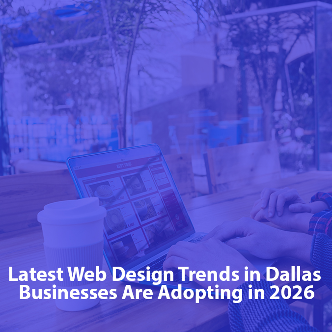
The Dallas commerce landscape demands diverse digital strategies. A Downtown Dallas corporate law firm needs unshakeable credibility, while an Uptown fintech startup requires frictionless conversion loops. Healthcare platforms in North Dallas look for accessibility, whereas Design District e-commerce brands focus on bold visual storytelling. To dominate this market, static templates will not work. Implementing the Top UI/UX Design Trends Dallas brands adopt ensures your platforms match local economic momentum. Forward-thinking companies rely on dedicated teams like Curate9 to turn modern aesthetic changes into high-converting digital realities. Let us explore five defining design developments shaping our local marketplace.
Aligning Human Psychology with Modern Digital Architecture
Before examining individual aesthetic shifts, we must address why the structural foundation of a corporate website is changing. A successful online platform is no longer just a display of information but a live environment where design directly influences customer choices. Modern user experience relies on a deep understanding of behavioral psychology. Every color contrast, animation speed, and layout choice either gently guides a user toward a goal or drives them closer to hitting the back button.
When a business updates its digital interface, it is doing much more than applying a fresh coat of paint. To truly appreciate how design shifts buyer behavior, consider these fast psychological facts shaping modern engagement:
- The 3-Second Window: Modern digital consumers form a definitive subconscious opinion about your brand’s authority within 50 milliseconds, and your primary message must hook them within three seconds before they bounce.
- F-Shaped Scanning Patterns: Users rarely read every word on a screen; instead, their eyes naturally map content in an “F” pattern, making structural layout and typographical hierarchy critical for landing your value proposition.
- Hick’s Law Optimization: The time it takes for a customer to make a decision increases with the number and complexity of choices presented. Streamlining your navigation choices drastically reduces decision fatigue and accelerates checkout or lead submission.
- The Aesthetic-Usability Effect: Human beings naturally perceive beautiful, highly polished interfaces as more reliable, secure, and easier to use than cluttered or outdated platforms, even if the underlying functionality is exactly the same.
Balancing visual innovation with functional stability ensures that your platform can hold a consumer’s attention span without ever compromising on page loading speeds or navigation clarity.
Implementing the Top UI/UX Design Trends Dallas Brands Need to Know
To capture the attention of a fast-moving market, local companies must radically change how they approach digital product engineering. Implementing the Top UI/UX Design Trends Dallas brands leverage shifts your website from a passive brochure into an active commercial pipeline. The modern design movements outlined below represent a fundamental change in customer engagement, where visual innovation merges seamlessly with behavioral strategy. By embracing these progressive interactive principles, your business can build high-performance gateways that command authority, eliminate checkout friction, and outpace the competition.
1. Immersive 3D Elements and Spatial Depth
The flat, two-dimensional interfaces of the past are officially making way for three-dimensional digital depth. Thanks to massive leaps in web browser performance, intricate 3D graphics no longer compromise page load speeds. This approach is highly effective for Dallas commercial real estate firms, custom home builders, and luxury retail brands looking to present complex products.
The core philosophy relies on mirroring human interaction with physical objects. By introducing visual layers and shadows, the screen transforms from a flat pane of glass into a tactile, explorable environment. What makes spatial depth unique is its power to replace passive scrolling with active physical manipulation, which holds user attention and directly minimizes customer purchase hesitation.
- Enhanced User Engagement: Interactive dimensionality captures visitor attention far longer than traditional two-dimensional layouts.
- Realistic Product Previews: Dynamic modeling allows customers to view items from multiple angles before making a decision.
- Distinct Brand Identity: Adopting spatial design helps a corporate platform stand out from competitors relying on static templates.
- Optimized Performance: Utilizing modern web frameworks ensures these complex visuals load efficiently without draining system resources.
2. Motion Design and Scrollytelling
Static layouts often struggle to retain user attention. Modern motion design functions as an intuitive tour guide, using subtle animations and scroll-triggered narratives to lead a visitor’s eyes through your company story. This technique, known as scrollytelling, converts standard text blocks into an unfolding visual journey, making it a perfect tool for B2B corporate enterprises, tech startups, and hospitality groups in Deep Ellum.
Movement establishes a natural reading rhythm and increases emotional engagement. The design philosophy centers on guiding user focus organically without creating cognitive overload. Scrollytelling is uniquely powerful because the user completely controls the speed of the narrative via tracking or scrolling, which makes a corporate digital transaction feel deeply collaborative, responsive, and human.
- Guided Focal Points: Animations direct the eye immediately to primary calls-to-action, key statistics, or core brand statements.
- Controlled Narrative Flow: Content unfolds gradually as the user scrolls, preventing overwhelming walls of text.
- Interactive Micro-feedback: Small responsive changes, like a button shifting color when hovered over, give the user instant confirmation.
- Immersive Experience: Fluid transition curves keep users moving deeper down the page, significantly reducing bounce rates.
3. Dark Mode Personalization and Accessible UI
What started as a niche setting for developers has evolved into an essential design standard for premium business software. Offering a seamless dark mode toggle is now a fundamental pillar of inclusive, accessible UI design. Dark interfaces minimize eye strain in low-light environments and offer a sleek, high-end aesthetic that serves financial tech portals, software-as-a-service (SaaS) systems, and 24/7 client dashboards exceptionally well.
The underlying philosophy is that digital products must adapt dynamically to a user’s environmental context and physical health needs. Dark mode personalization is unique because it creates an alternative visual identity for your platform, allowing key elements and text to pop clearly while creating an atmosphere of corporate exclusivity and data security.
- Reduced Visual Fatigue: Softer dark backgrounds minimize glare and eye strain during extended evening browsing sessions.
- Energy Conservation: Optimized dark theme interfaces noticeably lower device battery consumption on modern mobile screens.
- High-Contrast Clarity: Carefully selected accent colors stand out sharply against dark backgrounds to highlight vital data points.
- Premium Branding Atmosphere: Deep charcoal and slate tones project a modern, executive feeling of luxury and security.
4. Gamified User Journeys
Gamification involves embedding reward-driven interaction mechanics into non-gaming corporate environments. Instead of treating actions like completing a user profile or submitting a legal intake form as a mundane chore, gamified user journeys transform standard data collection into interactive milestones. This technique provides immense value to corporate insurance agencies, healthcare networks, and complex financial consultation setups.
Human behavior is naturally driven by a desire for clear progression and achievement. By applying this psychological philosophy to business forms, companies can drastically reduce user frustration and cart abandonment. Gamified journeys are unique because they intentionally dismantle form anxiety, breaking long, intimidating input fields into bite-sized levels that keep clients motivated to reach the finish line.
- Visual Milestone Tracking: Progress bars and checked circles show users exactly how close they are to completion.
- Segmented Data Intake: Dividing complex forms into brief, logical steps removes cognitive friction and anxiety.
- Positive Reinforcement: Subtle celebration animations upon finishing a section provide immediate mental satisfaction.
- Increased Data Accuracy: Users are far more likely to provide complete, thorough information when the process feels interactive.
5. Vibrant Maximalism and Bold Typography
The era of predictable, minimalist white websites is drawing to a close. Brands are breaking free from rigid grids to embrace vibrant maximalism and bold typography. This high-energy trend blends vintage nostalgia with modern technical precision, serving independent consumer brands, boutique fitness groups, and independent retail operations that want to project a disruptive market identity.
The philosophy behind maximalism is that design should provoke an immediate, unforgettable emotional response. This aesthetic stands out because it treats custom typography as the primary graphic asset rather than just a tool for legibility, ensuring your core business message becomes an instant, unforgettable visual anchor the exact moment your website loads.
- Immediate Visual Impact: Saturated color combinations and oversized headlines grab attention within fractions of a second.
- Unforgettable Brand Recall: Breaking free from standard layout grids creates a highly distinct and memorable online footprint.
- Strong Textual Hierarchy: Giant custom typefaces force the visitor to read your most vital business value proposition first.
- Expressive Individuality: Layered visual components allow a disruptive brand to project confidence and cultural relevance.
What Makes UI/UX Feel Premium and Polished?
Adopting individual trends is only half the battle. To establish a true competitive edge in Dallas, your digital product must look, feel, and function like an executive asset. When a platform feels luxury-grade, users naturally attribute higher reliability and market authority to your enterprise. a premium and polished finish requires flawless execution across several hidden design layers:
- Anticipatory Motion and Easing Curves: Standard web animations often feel mechanical because they move at a constant, linear speed. Polished design utilizes custom easing curves that mimic real-world inertia, where elements start fast and decelerate smoothly to a stop so the interface feels completely organic.
- Visual Continuity and Component Harmony: A premium application maintains total stylistic consistency across every digital touchpoint. Every single button state, input field border, padding dimension, and icon weight must follow a unified system, projecting absolute deliberate precision.
- Intentional Use of Negative Space: Low-tier layouts often crowd pixels out of fear. Premium UI uses white space as a structural luxury, leaving generous breathing room around text and focal points to communicate sophistication while allowing the user’s eyes to relax.
- Tactile Feedback Loops: Every single action taken by a user must receive an immediate, subtle acknowledgment. Whether it is a gentle micro-animation when a file is uploaded or a soft visual shift on a mobile screen, instant confirmation reassures the user that your system is operating flawlessly.
This meticulous attention to detail is why working with a specialized brand incubation lab like Curate9 can transform basic digital frameworks into powerful tools of market differentiation.
So What UI/UX Design Fits Your Business?
The business landscape in Dallas moves far too quickly to rely on static, outdated digital design. Upgrading your user interfaces to match modern interactive standards is a foundational investment in future-proofing your corporate identity. The companies that command the market will be those that view UI/UX design not as a routine checkbox, but as a dynamic creative asset used to build deep, frictionless connections with their target audience.
By combining immersive spatial depth, purposeful scrollytelling, inclusive dark mode personalization, rewarding gamified journeys, and bold typography, your business can craft an unforgettable digital footprint. Curate9 understands both global technical standards and local corporate expectations. We can refine your digital touchpoints, and show your industry exactly what your business is capable of achieving.
Contact us for the top web design services in Dallas.
Frequently Asked Questions
How long does a standard UI/UX redesign project take with Curate9, and what is the process?
A comprehensive digital transformation typically spans 6 to 12 weeks, depending on system complexity. Our team follows a structured milestone path: discovery and psychological user mapping, interactive wireframing, high-fidelity visual design rendering, and prototyping. You receive complete access to a dedicated workspace to track asset delivery, give feedback, and review iterations in real-time.
Do we retain full ownership of the design assets, source code, and design systems?
Absolutely. Upon completion of the project and settlement of the final invoice, 100% intellectual property rights, interactive Figma design systems, source files, vector assets, and custom components transfer directly to your business. We set up organized, developer-ready component frameworks so your internal engineering team can scale the platform easily.
Can Curate9 collaborate with our in-house development and product engineering teams?
Yes. We frequently act as an embedded design unit collaborating with internal technical teams. We provide clean, fully documented, component-driven design libraries built on industry-standard design tokens. This ensures your front-end engineers can implement complex layouts, custom motion curves, and advanced spatial depth without any translation issues.